Categories
E-Commerce Web Strategy

Five Web Principles to Follow for your Next Launch

Five Web Principles to Follow for your Next Launch

Over the last several months, we had the opportunity to redesign and develop a new site for a manufacturing giant out of Michigan: Borroughs. Borroughs…

Over the last several months, we had the opportunity to redesign and develop a new site for a manufacturing giant out of Michigan: Borroughs. Borroughs has been implementing large-scale system integration projects for global companies for decades and has a fast-growing E-commerce business that doubled in 2021. To help Borroughs keep up with demand, we developed a clean, simplified site that inspires visitors to take action. Below are a few principles that we used to redesign their site and, when implemented, will benefit any business.  

  1. Pass the five-second test. This rule comes from Donald Miller’s workshop in 2017; however, it’s even more relevant in 2022. Within five seconds, website visitors need to know precisely: 
    1. What your business does
    2. How you’re going to make their life better
    3. Where to buy your product (or how to contact you — based on your primary call to action)
  2. Keep your load time down. This goes right along with principle one; if your site takes too long to load, you can count on a high bounce rate. This is especially crucial if you use paid advertising to drive traffic; website visitors without conversions equals throwing money out the window. Borroughs’ old site was bogged down by an excessive amount of plugins. By simplifying the site, we drastically decreased the number of plugins and improved their load time.
  1. Make your website scannable and speak directly to your audience. A fatal flaw is having too much copy and going extremely in-depth on products and services right off the bat. Although that is fine on certain inner pages, your visitors will likely never make it that far if you do that upfront. Your homepage should be scannable and easy to navigate so the visitor can move from point A to point B as quickly and seamlessly as possible. Most homepages would be better off cutting their copy by 50-80%. 
  1. Have a clear call to action (CTA). Calling your visitors to action displays confidence and we’re not talking about annoying pop-ups that disrupt the user experience. Although exit pop-ups can be effective when used on specific sites, we’re talking about directing visitors to clear actionable selections (i.e., shop, contact us, etc.). On Borroughs’ homepage, there are several very clean buttons to direct them to the correct location to capture that conversion. 
  1. Use aspirational videos and photos. On Borroughs’ site, we wanted to hone in on quality, durability, and that their products are made in the USA. It is for this reason that you see a quick montage showcasing their craftsmanship, products, and technology. You want images that get customers excited about what you offer and enable a vision of success with your product or service. 

You can check out the Borroughs site below, and if you need any help optimizing your website, reach out!

Categories
E-Commerce Web Strategy

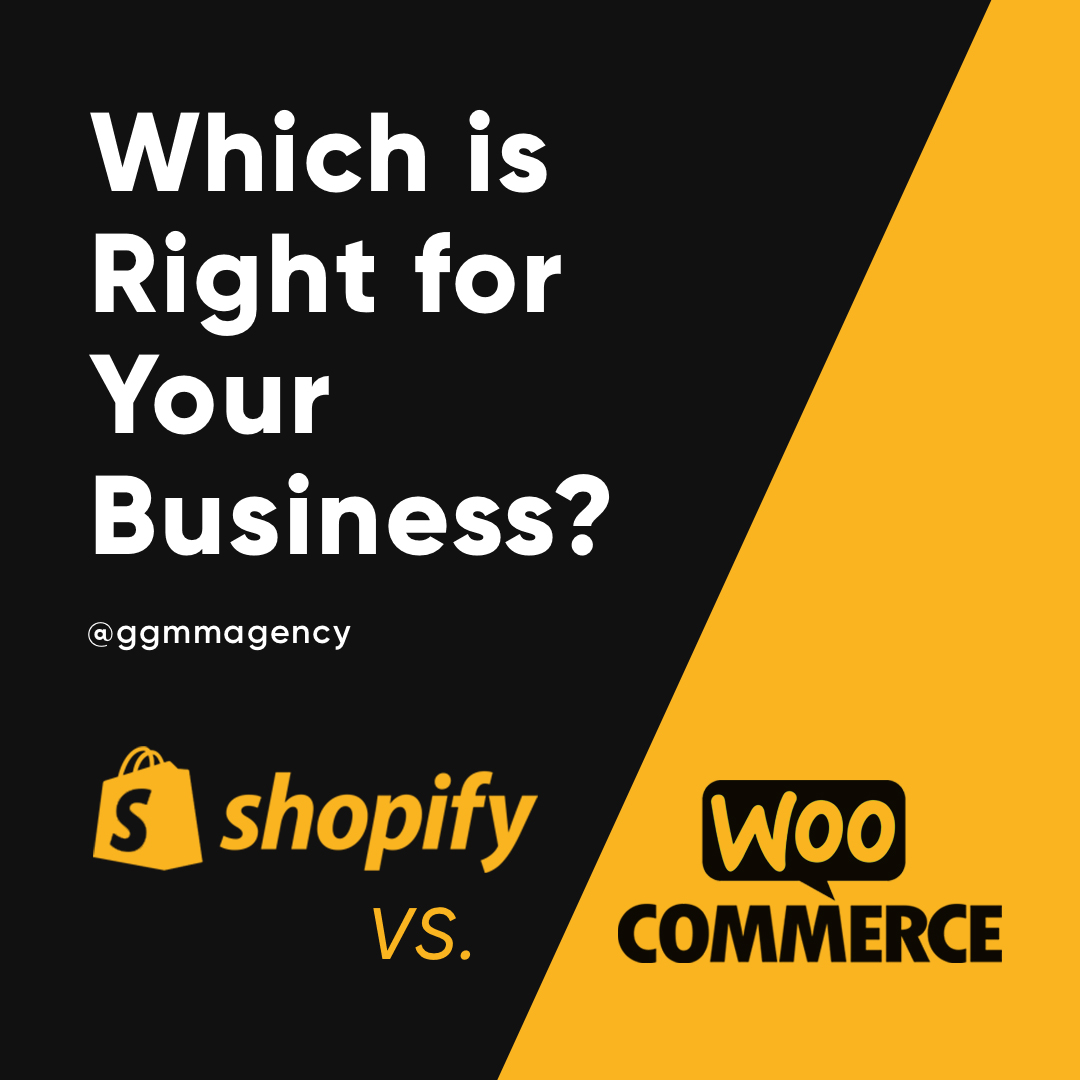
WooCommerce vs. Shopify: Which is Right for Your E-Commerce Business?

WooCommerce vs. Shopify: Which is Right for Your E-Commerce Business?

Building a new e-commerce website can be overwhelming, whether it be starting from scratch or migrating your current website to a new platform. WooCommerce and…

Building a new e-commerce website can be overwhelming, whether it be starting from scratch or migrating your current website to a new platform. WooCommerce and Shopify are the leading platforms for businesses who want to sell products online without breaking the bank. As a web designer and developer, I have found that working with both has its advantages and disadvantages. In order to pick the right one, you have to establish what the current and future goals of your website are. Here are a few things to consider while making your decision. 

A Clean and Simple Interface

It’s important for those updating your website to have a clear understanding of how to navigate the administrative side of the platform. Luckily, WooCommerce and Shopify both have fairly straightforward ways of editing content. Shopify certainly has a leg up in this category. Its clean interface allows you access to orders, products, and customer information making e-commerce its primary focus. WooCommerce is a free plugin that gets installed on your WordPress.org site. WordPress is not primarily an e-commerce platform; in fact, it is a blogging platform. With WooCommerce, you give your site the capability of selling products online. However, unlike Shopify, your WordPress site can get bogged down with plugins, making it more challenging to navigate.

Plugins, Plugins, and More Plugins 

Speaking of plugins, WooCommerce sites are known for having many plugins on the site. This can be great for those who want a more customized experience in WordPress and may be necessary for those who don’t want to dig into the code to make customizations. Shopify also has apps that can be installed to customize the site. Most times, plugins and apps are made by third parties, which rely on these third parties to be updated and maintained. When a plugin is neglected on the third party’s end, it is more apt to be out of date and not compatible with your chosen theme, WordPress version, or other plugins. This can cause a whack-a-mole like issue on your site, making it difficult to troubleshoot issues. 

Simplicity Comes with Restrictions

Now you may be leaning more towards Shopify, but WooCommerce far exceeds Shopify in its capabilities. When you start a Shopify site, you are given a choice between three different plans; these can be pricey depending on your needs. Also, Shopify has restrictive features, with no regard to what plan you choose. It restricts your ability to customize your checkout page, and it has a hard cap on how many variations and options you have within a product. There is also a huge difference in how page templates are created between WordPress and Shopify. Unfortunately, Shopify only gives you the capability of fully customizing the homepage template. Whereas interior pages and templates have to be coded in Liquid and then set up in a way where content editors can edit interior pages. This shows that Shopify does not have the same level of flexibility that WordPress is capable of. 

More than just an E-Commerce site

Your WordPress site and Shopify site will be hosted and managed in different ways. Shopify is a fully-hosted e-commerce solution. This means that Shopify is self-hosted. Your website will be hosted on Shopify servers, canceling out any worries of needing to find a hosting provider. If your business is solely focused on selling products online, without many other features, I suggest you try out Shopify’s 14-day free trial to see if it fits your needs. If down the road, you know you are going to need more than just e-commerce solutions, I would recommend WooCommerce. WooCommerce has the ability to integrate anything that a WordPress site can offer. It is highly customizable and comes with minimal restrictions. 

If you are still undecided or need help with a new web project, contact GGMM, and we will help you get started with your business goals in mind.

Categories
Web Strategy

Follow These Steps to Create a Website That Converts

Follow These Steps to Create a Website That Converts

Today, your website is more important than ever. In the COVID-era, with less and less face-to-face interaction and more people spending time online, your website…

Today, your website is more important than ever. In the COVID-era, with less and less face-to-face interaction and more people spending time online, your website is your chance to make an impact on potential clients/customers. The problem is that most companies don’t have a website that fully represents their brand, let alone converts visitors into leads and buyers. At GGMM, we have certain principles that we make sure we hit when we create websites for our clients (and ourselves) to maximize the conversion rates. Make sure you hit all the following points below and it will make a big difference! 

  • Pass Donald Miller’s 5 second test: Can someone land on your website and know immediately who you are, how you can make their life better, and where they can buy (or contact you) all within 5 seconds?
  • Is it scannable? Most companies have way too much copy on their site. People don’t read websites, they scan them. It’s fine to have more copy on inner pages if needed but make sure the homepage is scannable. 
  • Paint success. The only reason people buy things is to get from their current state to their future desired state. Show them what this future state looks like with your product. Make sure you are pulling images and videos that enable the visitor to picture themself achieving success with your product or service. 
  • Call your users to action. As humans, we tend to be lazy and need to be called to action. Make sure to have clear calls to action to contact you and buy throughout your site. 
  • Build credibility. People want to feel safe working with you so social proof is key. Make sure to have real testimonials, reviews, case studies, and client logos on your site.

For more tips view my LinkedIn video

For some example sites that we have built and consulted on take a look:

ERC Midwest 

Accutrans 

CityTins